Why Color Belongs in Luxury Interior Design

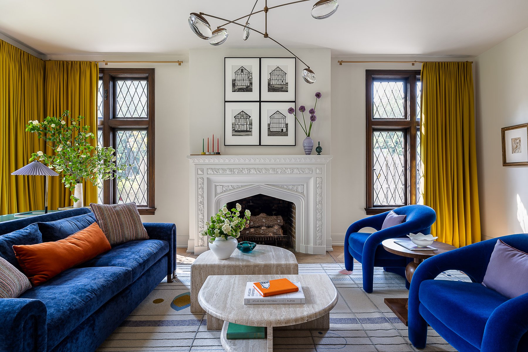
A bold blue library leads to a family room with a bold blue fireplace
My Origin Story: Falling in Love with Color in Chicago
When I was interviewed for my first interior design internship in Chicago in 2005, the business owner asked me what I really loved about interior design. Without stopping to think, I said “Color!” The man visibly cringed.
Why Neutral, Monochrome Interiors Dominated Early-2000s Design
You have to remember, this was a different time. Cool gray walls were seen as the chic antidote to the chaotic and colorful wallpaper (my mom had it!) of the nineties. White slipcovers were giving living rooms nationwide a reprieve from plaid, chintz, and brocade. And brushed nickel finishes—everywhere! mixing metals? are you INSANE?!—was the answer to the shiny, cheap looking brass finishes we had long been accustomed to.
Staying True to Color Through a Decade of Chicago Design
Despite his misgivings, this man hired me. And so did several other top designers in Chicago (though I learned to downplay my passion for purple….and blue…and green). Throughout my ten year career in Chicago, I played by other people’s rules, but never gave up my first love: colorful, sophisticated interiors.
Starting Bethany Adams Interiors: Designing Bold, Composed Palettes in Louisville
By the time I started Bethany Adams Interiors a luxury interior design firm in Louisville, Kentucky I had had it with boring. I was ready to finally express myself as a designer, and for me that means designing homes that are not just colorful—they are carefully composed compositions.

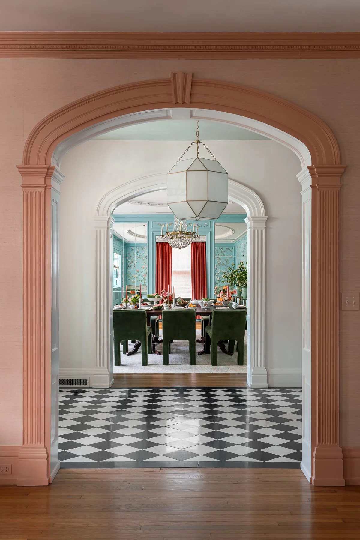
The dining room of a colorful Louisville, KY home….
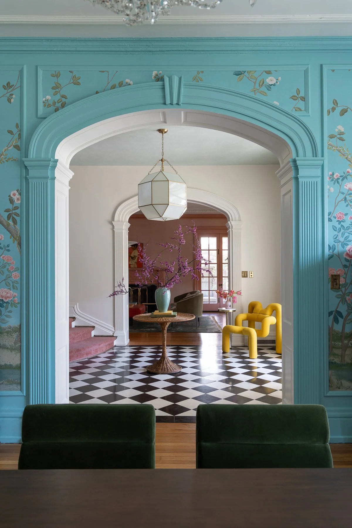
…leads to a foyer…
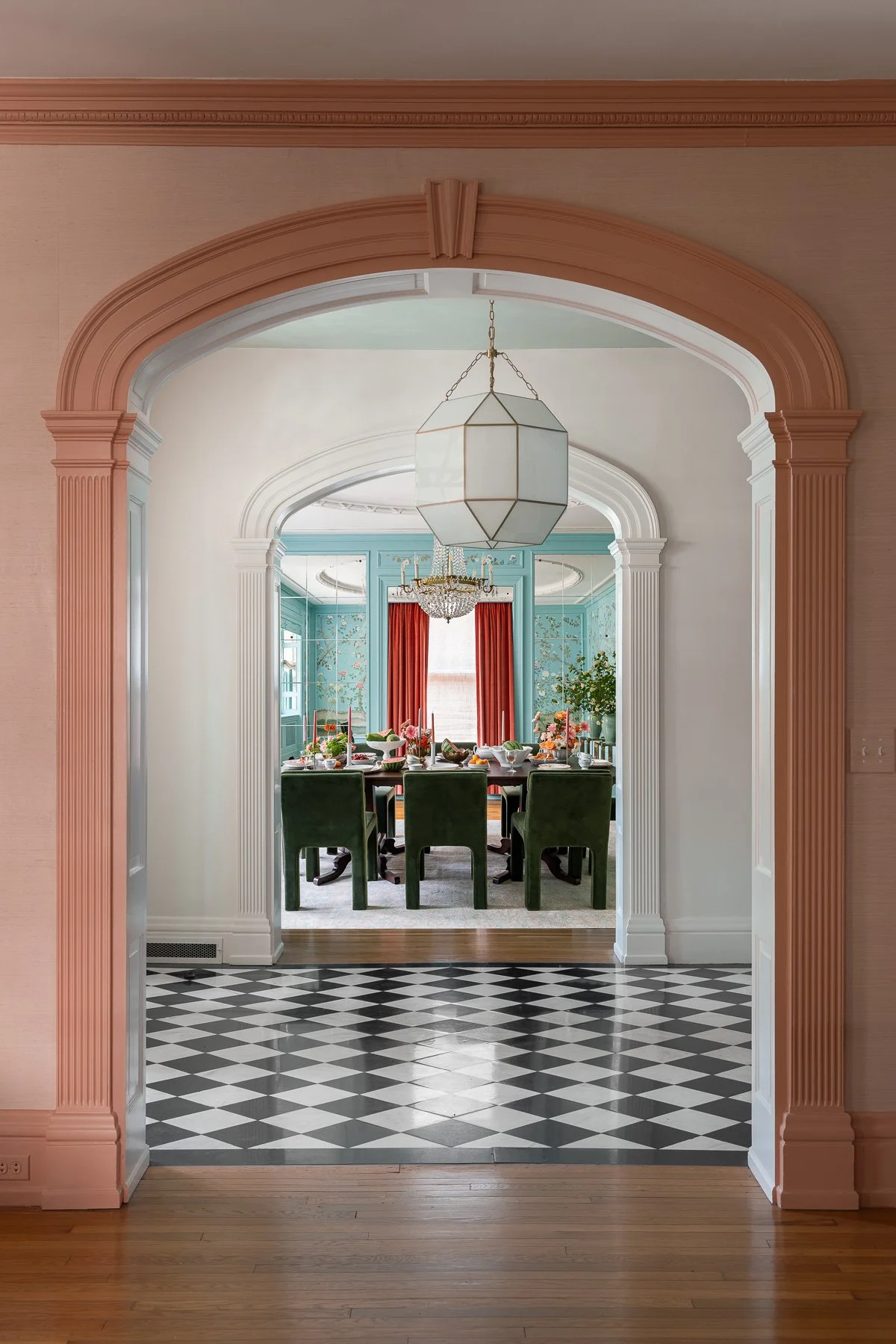
….which leads to a living room all reflected variations on a single palette.
The Difference Between "Colorful" and a Considered Color Story
This, to me, is the key difference and what takes the cringe out of colorful interiors. Bold, rainbow colored rooms are arresting and make for great instagram posts. But living in a composition consisting of several, considered and well executed micro-palettes is like living in your own, beautiful work of art.
Why a Well-Executed Color Palette Is a Mark of Luxury Design
Therein also lies the luxury. A beautifully constructed color story—one that moves with you from room to room—is clear evidence of professional design. Of caring enough about your home and the life you lead in it to hire an expert.
Frequently Asked Questions
Why does color belong in luxury interior design instead of an all-neutral palette?
Color, when handled by a professional, is a mark of confident, considered design rather than a risk. A well-built color story that carries through a home shows the same intentionality and expertise that luxury clients already expect from custom architecture or fine finishes — it's evidence of professional design, not a departure from it.
What is a "color story" or "micro-palette" in interior design?
A color story is a set of related, considered palettes that shift from room to room but still feel connected as you move through a home — as opposed to a single bold, rainbow-like scheme in one room. It's the difference between a striking Instagram moment and a home that feels like a cohesive, livable work of art.
Is bold color still considered timeless, or does it go out of style?
Trends toward all-neutral, monochrome interiors (like the gray walls and white slipcovers popular in the early 2000s) come and go, but a thoughtfully composed color palette — built around proportion, balance, and how rooms relate to one another — is what keeps color from feeling dated or chaotic.
How do you use color without a home feeling chaotic or overdone?
The key is composition: treating each room as a considered micro-palette rather than throwing in color at random, and making sure the palette carries a relationship from room to room. That intentionality is what separates a professionally designed colorful home from one that simply feels busy.
Do all the rooms in a home need to share the exact same colors?
No — the palette can shift from room to room, but each room's colors should feel like a variation on the same overall composition, so the home reads as connected rather than disjointed as you move through it. Craving a home with elegance, personality, and color confidence?
Bethany Adams Interiors can create a palette that feels unmistakably yours.
Continue Reading